You've got a spreadsheet or a CSV file full of numbers, and you need a chart — for a report, a presentation, or just to actually see what the data is telling you. You don't want to wrestle with spreadsheet chart menus, and you certainly don't want to upload a file of sales figures to some random website. Tekivex's CSV to Chart tool turns your data into a clean, downloadable chart right inside your browser, in seconds.
Not sure your file's ready? There's a Try sample data button so you can see how it works before touching your own numbers.
How to make a chart from a CSV
- Open the CSV to Chart tool. No install, no account.
- Drop your CSV file onto the tool, or paste the CSV text directly. Make sure the first row contains your column headers (like Month, Revenue, Expenses).
- Pick your label column — the one that names each item along the axis, such as Month.
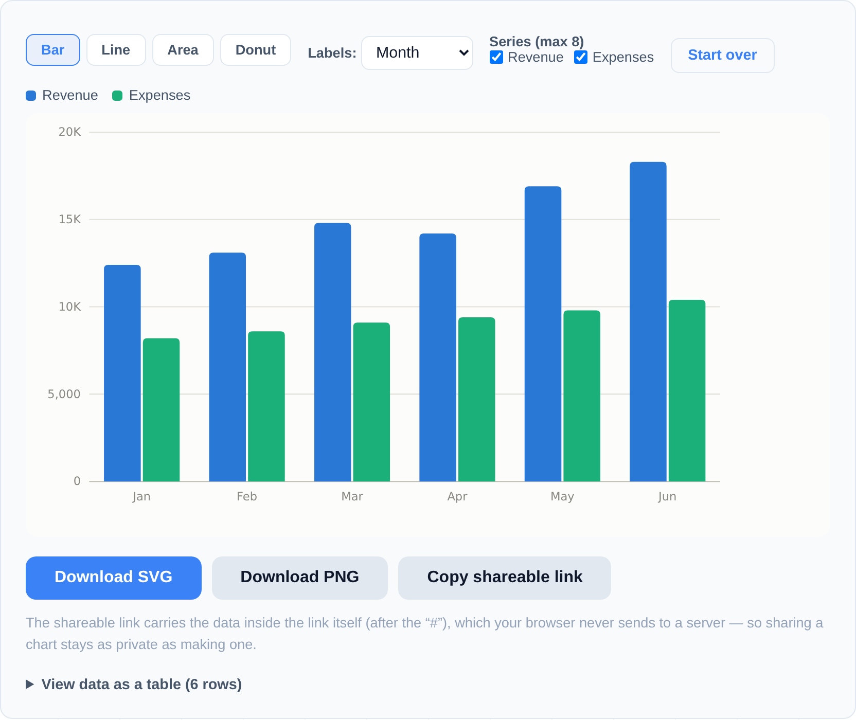
- Pick the numeric series you want to plot. You can chart up to 8 series at once, like Revenue and Expenses side by side.
- Choose a chart type: bar, line, area, or donut. Switch between them freely to see which tells your story best.
- Hover over the chart for tooltips with exact values, or view your data as a table to double-check it.
- Download the finished chart as an SVG (stays razor-sharp at any size — great for print and slides) or a PNG (a standard image). You can also Copy a shareable link.
Good to know and limitations
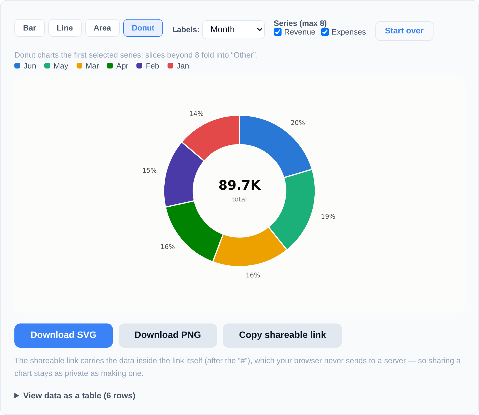
- Up to 8 numeric series. You can plot as many as eight series at once. For a donut chart, any slices beyond the top 8 are folded together into a single "Other" slice to keep it readable.
- Comma-separated files work best. If your file uses semicolons or tabs instead of commas, re-save it as a standard comma CSV first (most spreadsheets let you choose the delimiter when exporting).
- The shareable link keeps your data private. When you copy a link, your data is encoded into the part of the URL after the
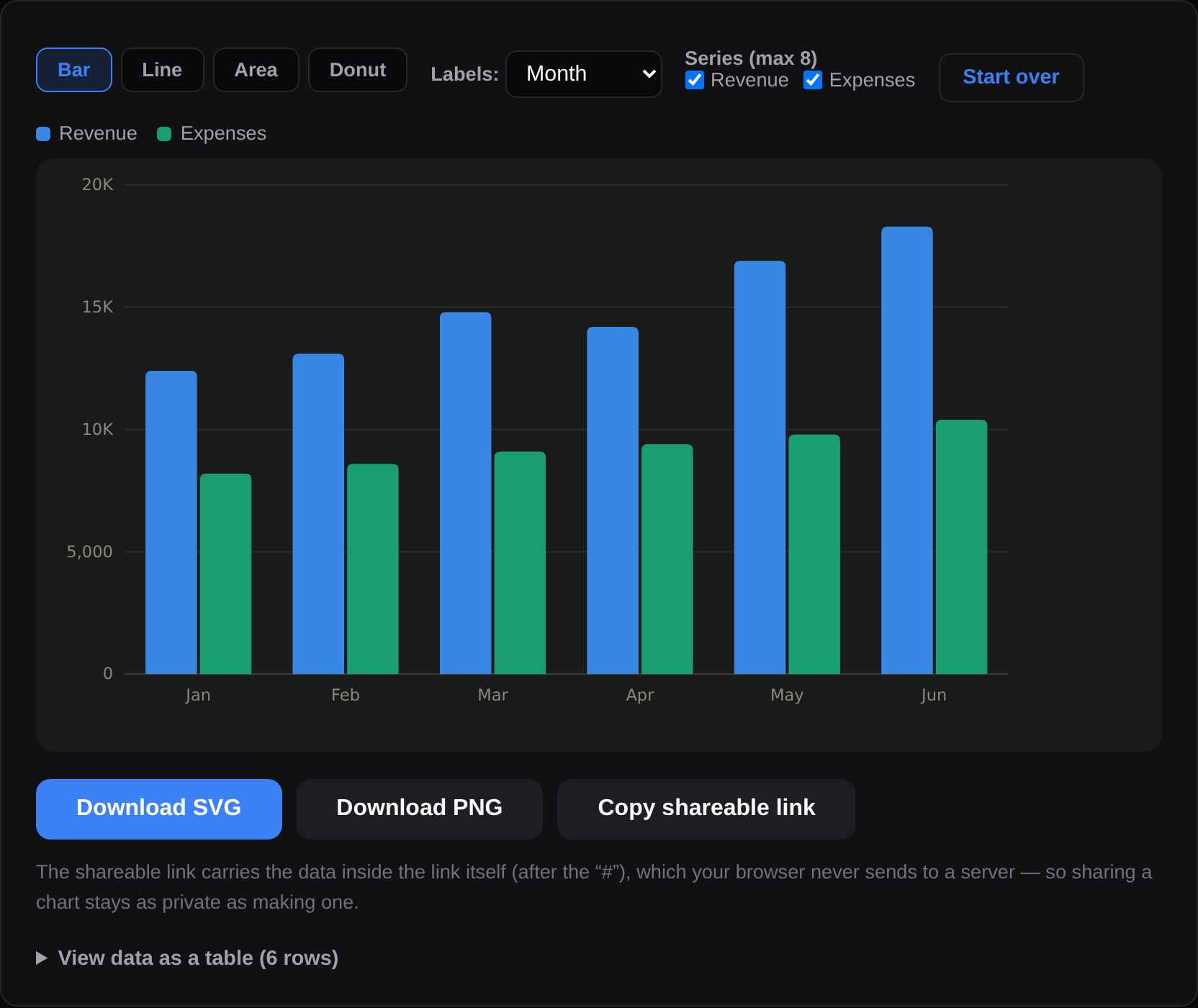
#symbol. Browsers never send that fragment to a server, so sharing the link doesn't upload your data anywhere — the recipient's browser rebuilds the chart locally. - Dark mode is supported, so your charts look right whether you prefer light or dark.
If you need deeper analysis — filtering, pivoting, exploring larger datasets — take a look at Analytics Studio. And if you're browsing our other free tools, the tools hub has the full set.
Picking the right chart type for your data
The tool offers four chart types, and the choice matters more than any styling option:
- Bar — the default for comparing categories: sales by region, tickets by team, spend by month. Bars stay readable even with longer category names, and every value is visible.
- Line — for anything measured over time. A line makes the trend the story: growth, seasonality, a sudden drop. Use it when the horizontal axis is dates or ordered periods.
- Area — a line chart that also emphasises cumulative magnitude. Good for showing volume building over time; less good when several series overlap and hide each other.
- Donut — for showing shares of a whole, and only that. Beyond a handful of slices it stops being readable, which is why the tool folds smaller slices into "Other" after eight — if every category matters, a bar chart tells the story better.
If you're unsure, try bar first and switch — the preview updates instantly, and switching costs nothing since the data is already loaded.
Where to get a clean CSV
Every spreadsheet and analytics product exports CSV: in Excel or Google Sheets use File → Download/Save As → CSV; most databases, banking portals, and admin dashboards have an "Export CSV" button. Keep the header row — the tool uses it to name your columns — and prefer comma-separated output over semicolons or tabs, which need converting first.
Frequently asked questions
What does my CSV need to look like?
A header row on top, then your data below it, comma-separated. One column holds labels (like Month or Category), and one or more columns hold numbers. If you're unsure, hit Try sample data to see a working example.
My file uses semicolons — will it work?
Re-save it as a comma-separated CSV first. Most spreadsheet apps let you choose the delimiter when you export, so pick comma. Tab-separated files should be converted the same way.
Should I download SVG or PNG?
Choose SVG if you want the chart to stay perfectly sharp at any size — ideal for printing or large slides. Choose PNG if you just need a regular image file to drop into a document or message.
If I share the link, does that upload my data?
No. Your data is packed into the URL after the #, and browsers never send that portion to any server. The person you share with has their chart rebuilt entirely in their own browser. More on this in why browser tools keep files private.
Your data never leaves your browser — the chart is built entirely on your own device.